Pantene Brand Redesign
Branding • Advertising • Staging • Logo Design
I was tasked with taking the haircare brand Pantene and creating a new look and personality through my design. My goal was to target an audience of teens and young adults who might have overlooked Pantene due to its generic branding. To accomplish this, I used simple and luxurious graphics, colors, and type paired with a focus on organic ingredients and health to match modern trends.
Logo and Rebrand
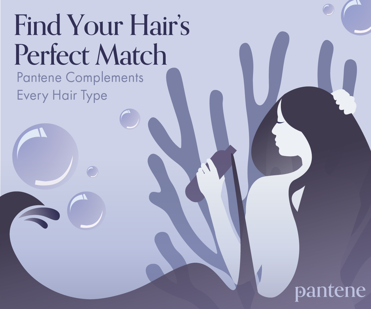
Due to the focus on natural ingredients I decided to use a motif from nature for the logo. I settled on using a piece of coral as inspiration for the design since it would invoke images of the sea, tying the water used while showering with Pantene to the water in a scenic ocean. I kept the logo simple and modern, taking inspiration from newer brands that are popular with a younger audience.
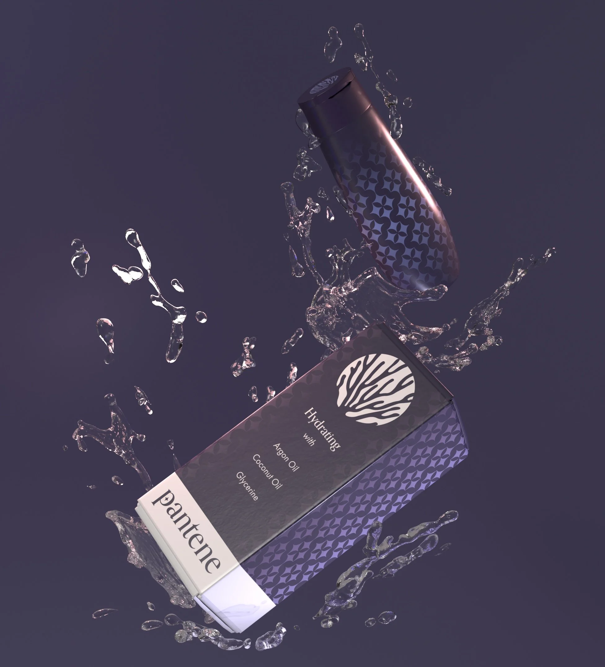
Keeping in line with the aesthetic I established, the packing continues the minimal and luxurious look. I completed market research into competitors to see what was currently trending in cosmetic packaging design. The packaging uses the same dark purple color that is consistent throughout the brand. On top of the color is a holographic pattern that gives the packaging more depth. Simple type lists the ingredients to give the consumer a feeling of brand transparency.
Packaging
To complete the rebrand I created two alternate advertisements. One was designed for a print medium in a magazine and the other was designed to be a digital web ad. The ads continue using the water imagery that the coral from the logo is connected to. The water elements are illustrated alongside a female figure, which alludes to mythological creatures like nymphs and mermaids.
Web and Print Ads